♥ Week 3 Devlog ♥
Hi Everyone! Week 3 is finally out of the way, we're starting to get close to the Midway point of the Jam!
Bit of a derail this week, I lost some of the time (in part to a metal concert and the hangover it left me) but overall the week was still productive.
- Quantity over Quality -
I had a playthrough of (what I have of) the game with my boyfriend (who is a writer) to have his opinions on it and the process of playing through the game in full for the first time was unintentionally was hilarious.
John called it "The definition of quantity over quality" (despite him being very supporting and believing it overall to be good.)
Some work'll be needed on the second pass, that's for sure. But I had so much fun laughing at it I'm somehow more motivated to work than before I went through it.
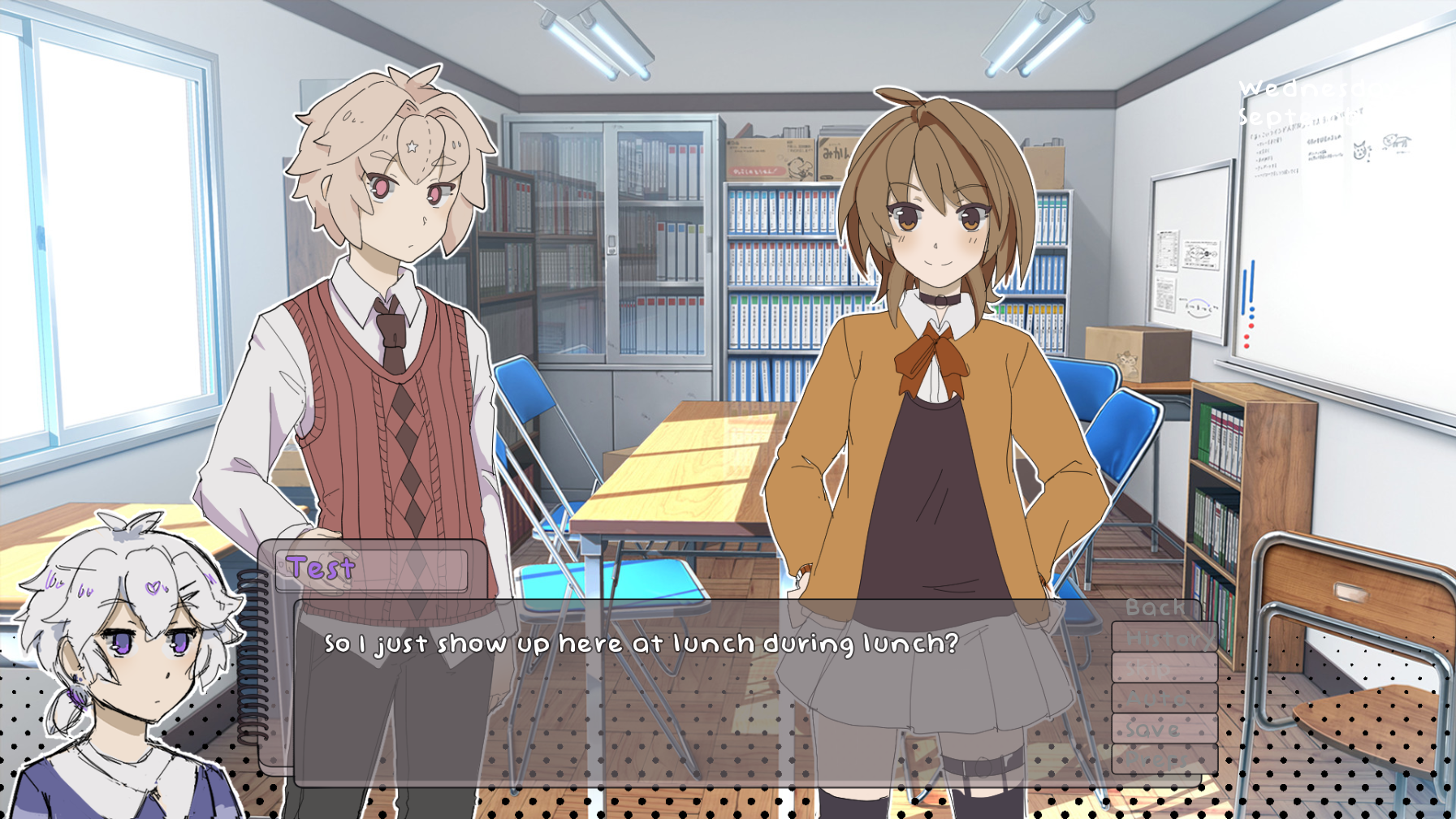 I forsee the word count going down in the next couple weeks.
John had trouble reading both the font and how it lined up with the textbox, so I removed the lines and will start looking into better fonts...eventually.
- Filling in the holes-
Starting to patch the areas of the VN - Currently word count is at 14k words. Some of that has been reworking areas to better suit what I was going for, fixing up awkward wording, and of course, filling in some of the gaps I have in the script.
I'll easily blaze past the 15k point I'd estimated, but I now know exactly what I still need to write to get to the end goal. I don't really want to go past 20k if I can help it, and will try and be rigourous when I cut things out in the revision process.

Making use of Renpy's "#TODO:" feature, thanks to Vimi's wonderful video pointing out it exists.
- Character art progress-
Nala and MC's sprite are all cleaned up! That's one of my Week 3 Goals taken care of:

Now that MC's sprite is finished, I can make dumb memes with all the headshots together:

Glad to know I have all bases covered.
Ever since I first did Arley's sprite, I've been unhappy with it, so I've finally tweaked it to something more resembling what I was feeling in the sketch.

First year of High School VS Last year of High School
Next week I'll start making/adding in expressions!
- Sketchup boxing match-
In preparation for Month 2, I decided to Download sketchup and start messing around with it.
My plan for the backgrounds is to have something a little abstract and using 3D, instead of hand-drawing everything. I'm using Uncle Mugen's School , which is the same resource the placeholder images are from.
Inspiration comes primarily from a Visual Novel from a Vocaloid producer (Shitoo) I played a few years back. I really like the way the backgrounds were handled, and wanted to do something similar:

eng translation one day plsssss
Here's what I've got currently:
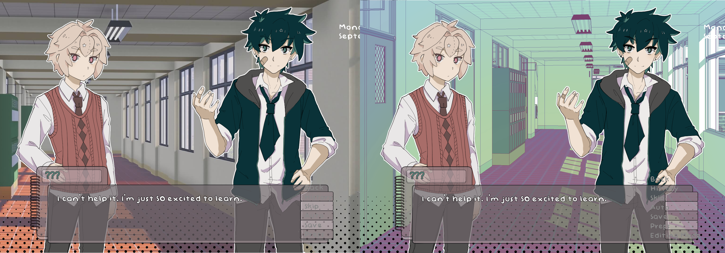


I think I need to change up the shadows for the sprites now, to match better, or change up the colors (most likely a bit of both) but conceptually, everything works out. I know what I'll be doing in Month 2.
That last shot I'm particularly proud of- I managed to assemble roughly what I want for the student council room out of the classroom assets:
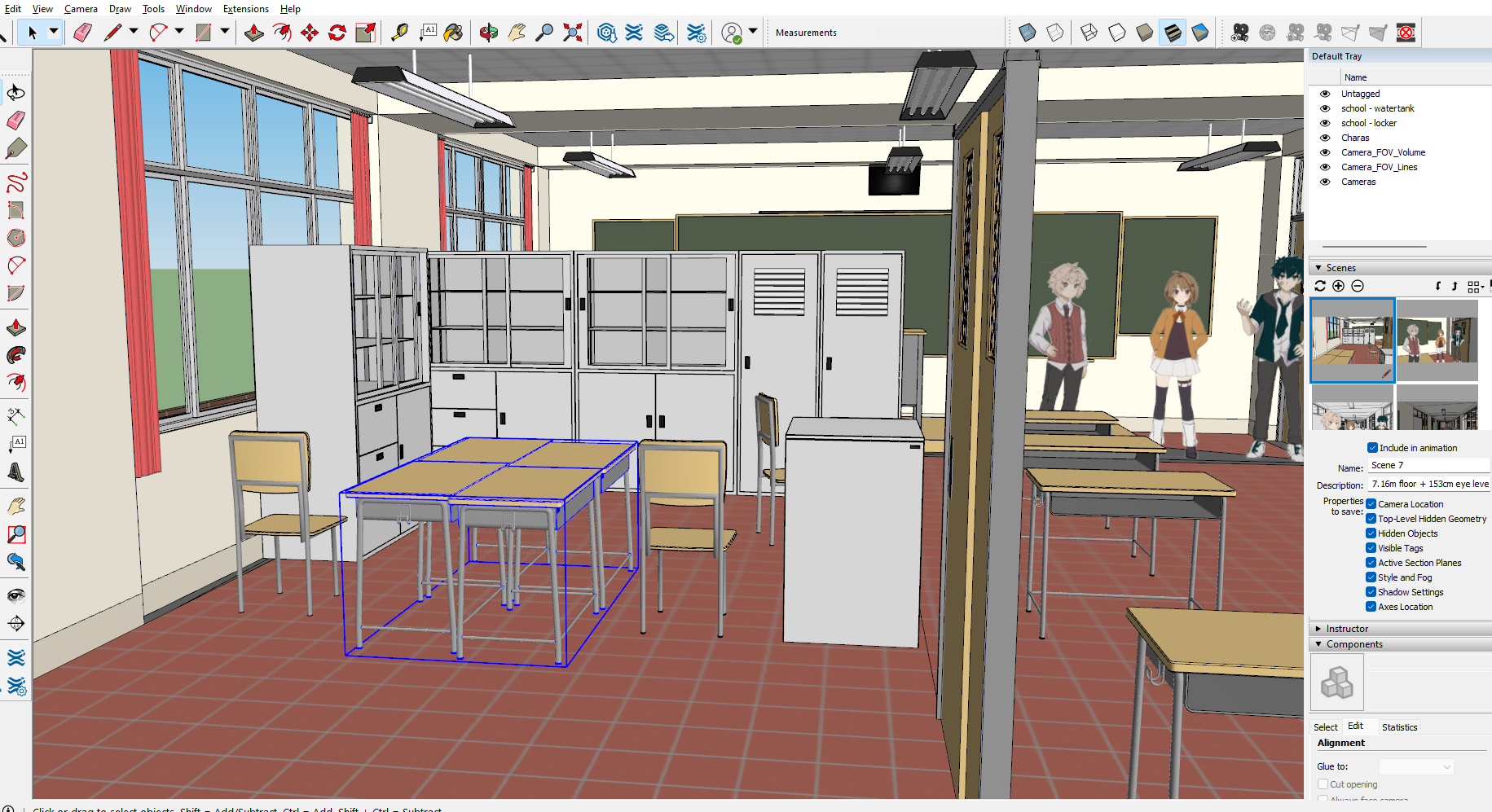
I also fitted the sprites into fullbodies so I could use them in sketchup with a rough idea of their correct height:

Don't think they'll show more than thigh-up in game, but it's nice making sure everything lines up the way it should.
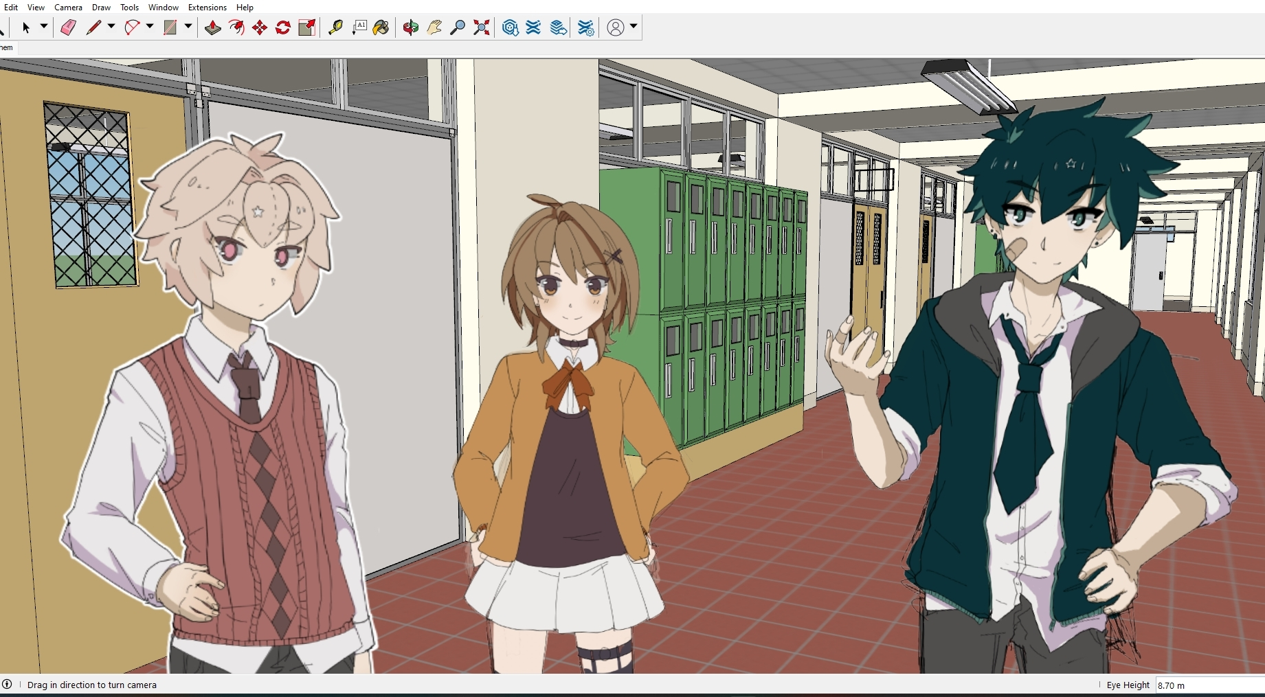 Kinda cool getting to see them in 3D (even as flat .pngs)
- Perspective Gripes -
However, there are problems in using 3D that I ran into that I wasn't expecting as a 2D artist. I've also seen many Visual Novels do this, unfortunately.
This might solely be in nitpicky territory, but I love to nerd-out about perspective and as it pertains to 2D art, and (most of the time) the final result with a VN is 2D. I also have no room to talk if I can't solve this problem for my own visual novels- I'm trying to make things I myself would like to play! So here's the process I went through in solving this issue.
I think this is an issue hyper specific to Visual Novels too, due to the way 3D programs work, so I'll do my best to explain:
So here's a shot straight from sketchup, with Hayden, Nala and Arley all at their correct heights in proportion to MC: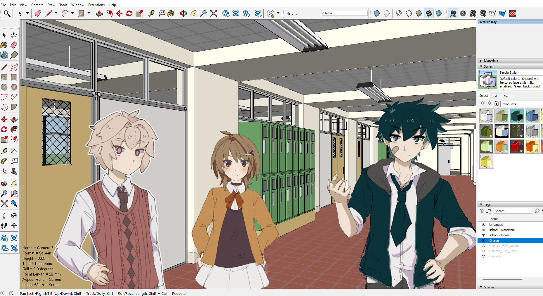
For reference, MC is 170cm, with an eye height at about 153cm:
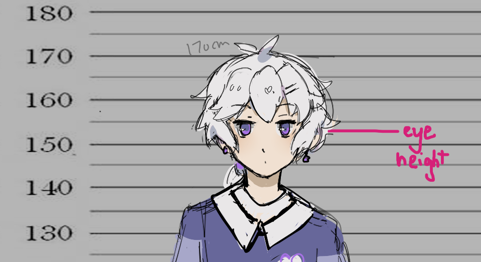
And according to sketchup, the 3rd floor (of which the Characters are on) is at 7.16m, so adding MC's eye height to that, we have 8.69m as the final eye height. The camera is looking straight on, through that little cross in the center of the screen.
So far so good! Shot looks like it makes sense logically, and if this was a 2D Illustration, this would work no problem.
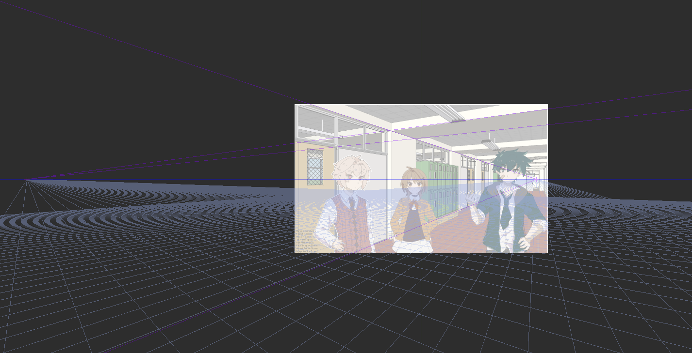
Clip studio perspective grid checks out.
However, for a visual novel scene, it falls apart quickly, when you remember you have to overlay sprites that (should) take up a lot of the space on screen:
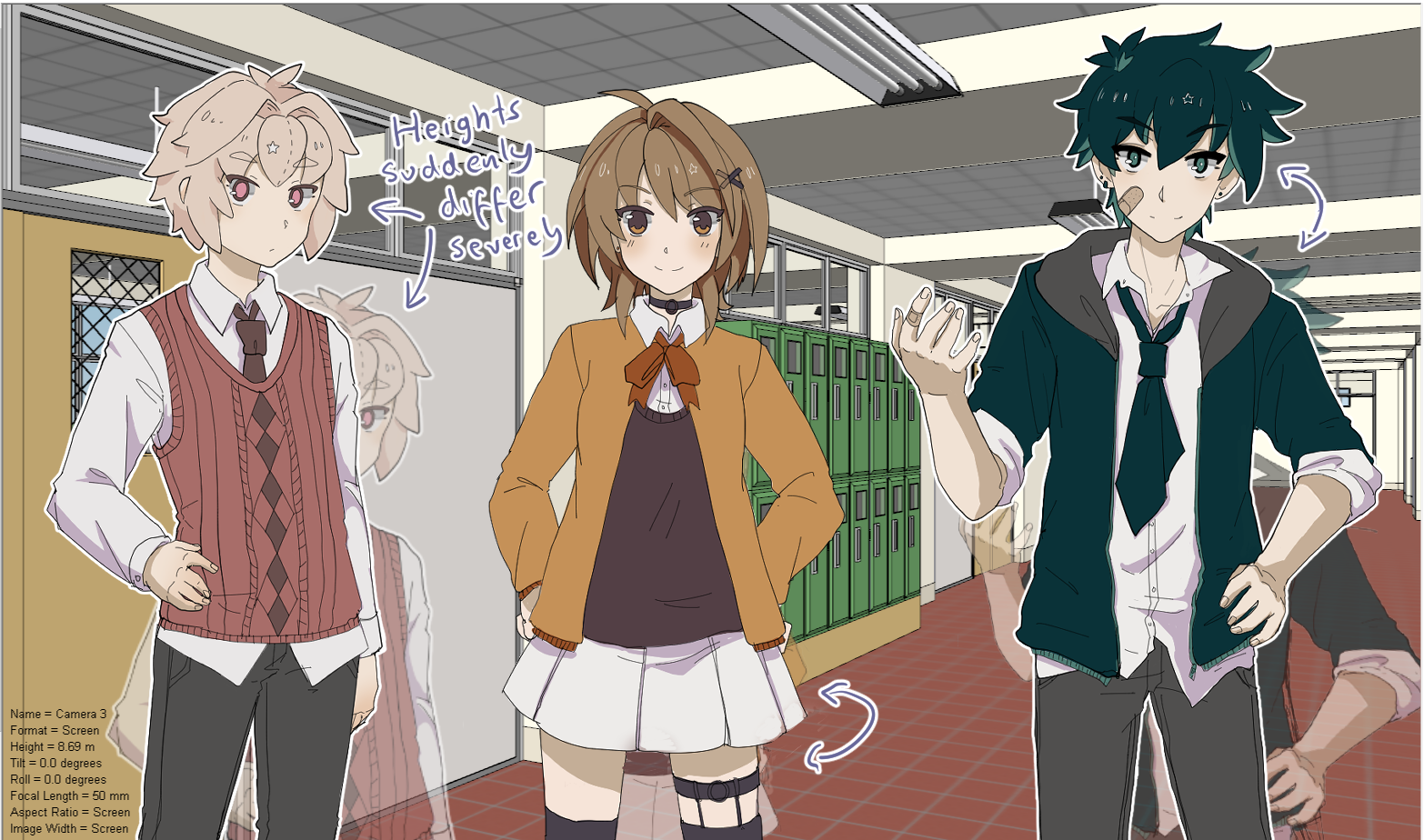
The end result doesn't look too bad, until you realise none of them can fit through the door behind them.
Clip studio's grid illustrates the problem pretty well- the eye height of MC is in the middle of the screen, putting them at chest height for the sprites on screen:
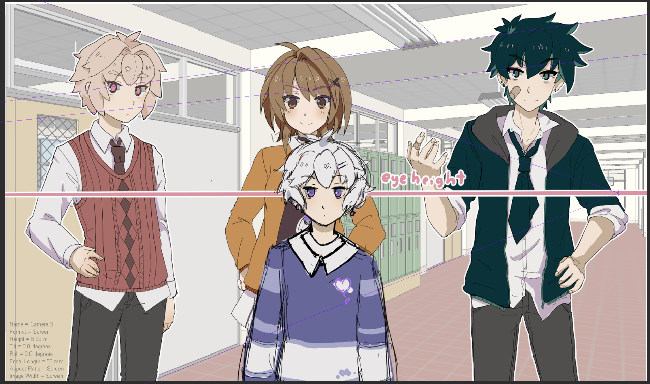
So you can have the math all correct, and a render that functions as it should, but is immediately ruined by the need for VN sprites.
3D programs have their camera in the middle of the screen for ease of use. It just makes sense- only in making the end result 2D art do I think you'd need to offset it.
Moving the shot + MC upwards, we get a glimpse of what the end result SHOULD look like: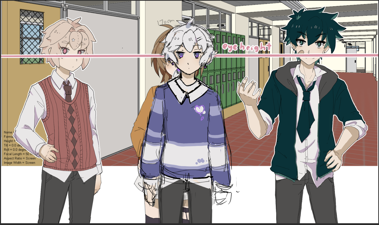
The problem is now all that white space at the bottom. How do we account for that?
We could draw the bottom half, but it's unlikely that'll look seamless. I don't want to heavily edit the sketchup shots to match a drawn version, either. I'd prefer to just have a 3D image that covers where I need it to.
Here's the solution I'm currently using. I make the render from sketchup VERY BIG with a FOV around 40. Then I just line up at the correct eye height, and the shot looks relatively alright:
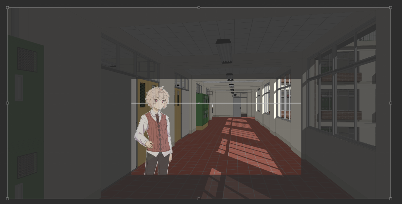
Only using the middle section hides the distortion pretty well.
(I need to work out exactly the difference between Sketchup's Field of View and Camera Focal Length ( I understand them independently, but specifically how they interact and what's preferable to use is something I still don't have a great grasp on.)
So that's it for my background issues. Unless I'm an idiot, and there's some kind of obvious solution I'm overlooking. If anyone's a pro with sketchup and has a better solution for this, I'd love to hear from you.
I'll report on how I'm going to stylize beyond this point once I figure that out.
- In Conclusion -
So, to summarize week 3: Not bad! Definietely straying from the path a bit, but I feel like I've gotten about half of the background work out of the way already... so, I think this puts me ahead? Or it would, if the script wasn't continuously growing. Let's see how week 4 goes before I worry too much.
Week 4 goals are:
- - Finish up the script, and have a better idea for the final word count (Same as last week!)
- - Have a plan for each character's expressions, get them sketched out at least
- - Maybe split Hayden and Arley's routes into seperate .rpy files, for ease of comparison.
- - Literally just get those holes in the script FILLED that's probably priority #1 rn
And that's it for this Devlog! ( Apologies for the length of this one.)
I'll see you next week for week 4.
Thanks for reading! ♥
Get Just Kiss Him Already!
Just Kiss Him Already!
Help two cute boys get together!
| Status | In development |
| Author | Ekkoberry |
| Genre | Visual Novel |
| Tags | Amare, Anime, bl, Boys' Love, Cute, Gay, LGBT, Ren'Py, Romance, Yaoi |
| Languages | English |
| Accessibility | Subtitles, One button |
More posts
- ♥ Android version added! ♥Apr 22, 2024
- ♥ JKHA 0.9.4 Update! ♥Dec 31, 2023
- ♥ JKHA 0.9.3 (April Fools) Update! ♥Apr 01, 2023
- ♥ JKHA 0.9.2 Update! ♥Jan 03, 2023
- ♥ JKHA 0.9.1 Update! ♥Nov 08, 2022
- ♥ JKHA Postmortem ♥Sep 09, 2022
- ♥ Week 8 Devlog ♥Aug 25, 2022
- ♥ Week 7 Devlog ♥Aug 18, 2022
- ♥ Week 6 Devlog ♥Aug 10, 2022
- ♥ Week 5 Devlog ♥Aug 03, 2022
Comments
Log in with itch.io to leave a comment.
This is so thorough!! I love reading your updates. I was not aware of Ren'Py's To Do list either that's super interesting to know.
Thank you! 5 years into using Renpy and I just learned about it myself LMAO